


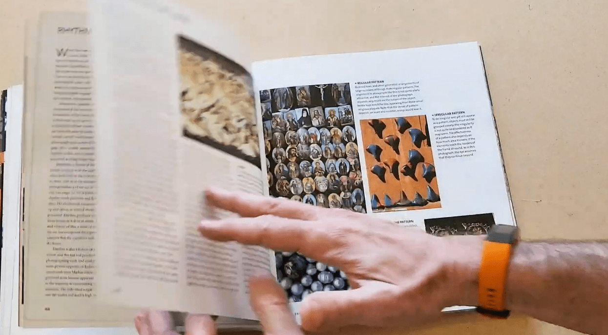
Most photography books begin with the exposure triangle, which is made up of aperture, shutter speed, and ISO. It’s laid out like a driver’s ed manual. They’re useful in the same way that directions are. After reading them once, you put them down and keep taking pictures that don’t seem to fit together or make sense, and you’re not sure why.
The Photographer’s Eye by Michael Freeman begins in a very different place. This page does not have any camera settings. There are no workflow guides, sensor specs, or chapters that explain how to get the right exposure when the camera is backlit. We can all agree that Freeman wants to know what makes some photos work and why they make you stop and look. But this is something that is harder to teach and, to be honest, harder to learn.
It has six sections: Image Frame, Design Basics, Graphic Elements, Photographic Elements, Composing with Light and Color, and Intent and Process. The book is 192 pages long. That building looks and sounds dry on paper. It’s not. While the first four chapters break down the visual geometry of images, they don’t really feel like lectures. Instead, they’re more like someone finally naming things you’ve felt but couldn’t put into words. Freeman talks about each idea in a few pages of text: leading lines, balance, positive and negative space, and dynamic tension. The photos then do the real teaching.
That is something to pause on. The pictures in this book aren’t just for looks. That’s the lesson. There are little diagrams with each picture that show exactly how the shapes, forms, and tonal relationships make the effect being talked about. Overlaid diagrams show the forces pulling at each corner of the frame in the chapter on dynamic tension. This shows how the image creates visual stress and why that stress is sometimes exactly what makes a shot interesting. This is the kind of breakdown that you can’t get out of your mind. It seems like Freeman doesn’t want to tell you what to do as much as he wants to teach you to see what’s already there.
Finally, the last two chapters shift the focus to the photographer’s process and intent. They talk about what you’re trying to say with a picture and how the choices you make in the viewfinder either help or hurt that intended message. Freeman shows the small differences between a good frame and a great one by putting outtakes next to the final pictures. Sometimes the differences aren’t as big as you might think. Part of the point is that.
There is a chance that some readers will disagree with some of the text’s broad statements. Freeman writes at times as if they are giving rules, but photography is rarely that simple. But that’s not a big problem with a book that mostly earns its credibility. Photographers of all levels seem to find something useful in it. For example, beginners get a framework they didn’t know they needed, and experienced photographers often say it just put into words what they were already doing naturally.
One useful thing to know is that this book is best read slowly. When you read from cover to cover all at once, the ideas start to blend together. Working on a few techniques, looking at the pictures for a while, and then going out and taking pictures before coming back is a better way to do things. Once you’ve tried to use the ideas in the field, they tend to settle in a different way.
There is also an older book by John Szarkowski with the same name. It is a museum theory book that looks at how photographs create meaning from a more historical point of view. You should know about both of them. It’s not that they’re competing with each other, but that they’re looking at the same question in different ways. The more useful of the two is Freeman’s, which was made for people who want to improve what they make instead of looking at what is already there.
This book is likely the first thing that people who have looked at their own photos and wondered why they don’t land the way they should should read.
